
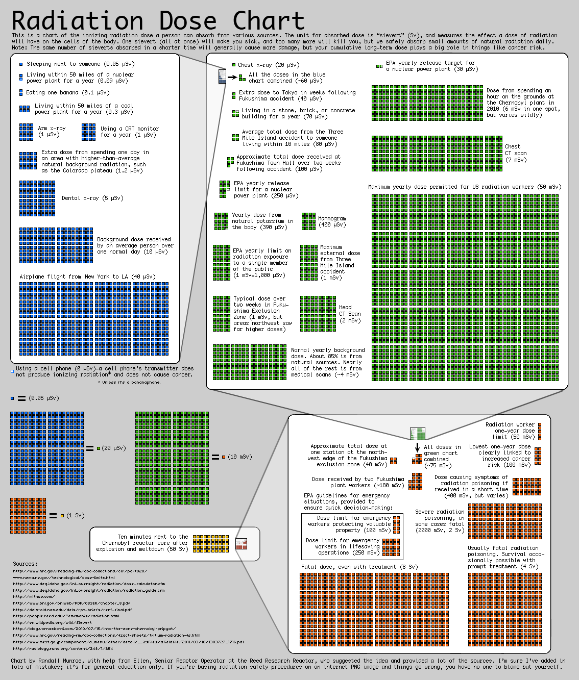
This chart from XKCD shows the ionizing radiation you might absorb from various sources according to the standard sievert (Sv) measurement unit.
The interesting thing about this chart is it allows you to compare radiation absorption of a wide range of activities from the smallest risk, sleeping next to another person (tiny risk); to something greater but not really that bad in the end, such as being 50 km away from the Fukushima site in Japan; to something catastrophic, like being next to the Chernobyl reactor core after its explosion and meltdown. The chart helps you to understand where a fatal radiation dose stands within that great range.
XKCD gives a disclaimer that the chart probably contains mistakes and warns that “if you’re basing radiation safety procedures on an internet PNG image and things go wrong, you have no one to blame but yourself.”
The following image is linked from the original — click on it to inspect the original at full size.
AB — 19 March 2011
