Natalie Zmuda, writing for Advertising Age, says that Tropicana’s full-reverse on its new branding for its Pure Premium orange juice line was surprisingly quick. “Beverage experts were hard pressed to think of another major brand that had pulled the plug on such a sweeping redesign as swiftly as Tropicana,” she writes. (See “Tropicana Line’s Sales Plunge 20% Post-Rebranding,” April 2, 2009.)
Her article gives some of the sales figures behind the reversal: “After its package redesign, sales of the Tropicana Pure Premium line plummeted 20% between Jan. 1 and Feb. 22, costing the brand tens of millions of dollars.”
At a press conference in January 2009 by Pepsico (owner of the Tropicana brand), Peter Arnell, CEO of Arnell Group, the branding agency that executed the redesign, explained his rationale (See Ad Age’s video of the press conference here):
We thought it would be very important to take this brand and bring it or evolve it into a more current or modern state … Historically, we always show the outside of the orange. What was fascinating was that we had never shown the product called the juice. There was a strong drive to bring a big messaging onto the carton where the biggest single billboarding was.
I think it was in the billboarding where Arnell failed. The instant I saw the two carton designs side-by-side, my first thought was, ‘The new one looks like a store brand.’:

Really, which one of these designs does a better job of billboarding? On the new carton, every color has been drained out (except the cute new squeeze-cap, which Pepsico will be retaining), and the new font looks almost generic.
It makes me wonder what kind of testing Arnell did with this new design. I would think one important part of the process would be to stock a supply of the new package design in an actual grocery-store cooler or shelf to see how well it stands out against the competition.
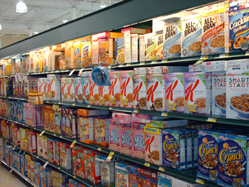
For a good example of on-the-shelf billboarding, take a look at this cereal aisle:

See how Special K stands out on the shelf? The packaging does it.
In one of our ILO Institute reports (“Best Practices for CPG Design Teams”), we commented on the contribution packaging can make toward getting the attention of shoppers in the store (we used this same photo in the report):
As an example of simple visual differentiation through packaging, we note that Special K achieves high visibility on the retail shelf with standard package sizes using one simple graphic technique – making sure that on the front of every package is a big red “K” with a mostly white background. This emphasizes Kellogg’s offering by placing a distinct swath of giant “Ks” across the cereal aisle.
We also used the following example from spice company McMillan:

In our report, we commented:
McMillan’s shelf dispensing system achieves strong visual emphasis for its spice products. In the case of the display shown here, McMillan’s has even gotten the retailer to agree to alter its shelving configuration to accommodate the dispensing system.
This emphasizes the importance of including on the product design team members who are knowledgeable about the retail destination of a new product and the restrictions likely to be encountered in the store.
One positive aspect of the Tropicana re-branding debacle is that we analysts now have another negative case study to refer to!
AB — 3 April 2009


