New wristwatch uses a linear rather than circular clock face

Just yesterday I read on The Watchismo Times (a blog dedicated to unusual timepieces) about a new mechanical wristwatch designed with a linear time display rather than the traditional circular clock face. (See “Urwerk King Cobra CC1 Reintrepretation of 1958 Patek Philippe Cobra Prototype – Cylindrical Retrograde Linear Jumping Hour Display.”)

This design is thought-provoking: We normally conceive of time as a line, and yet for centuries the standard timepiece interface has been a circle. The author of the Watchismo site explains why this is:

Why do we think of time as travelling in a straight line yet display it rotating around a circle? The answer is straightforward: mechanisms that continually rotate are much simpler to produce than those that trace a straight line then return to zero. In fact, the latter is so difficult that, until now, nobody has ever managed to develop a production wristwatch with true retrograde linear displays.

It makes me think about how I conceive time personally. In the big picture, I think I do see time as a straight line going infinitely to the left and right.

In spite of the more linear design of the calendars I use, I believe I conceive of the calendar as a circle, as if the year were superimposed on a standard clock face. However, in my mind, the calendar runs counterclockwise with January at approximately the 11:00 position. I think my circular conception of the calendar comes from the periodic nature of the solar year. Why the year goes counterclockwise in my mind I don’t know.

When it comes to my conception of days, though, I see some ambiguities. I do conceive of them on some level as a circle of 24 hours, but on reflection I think that conception is at least partly based on the circular clock faces we use to keep time, as well as on the collective 24-hour standard we use to keep our society synchronized.

Certainly the new Urwerk King Cobra CC1 provides food for thought about how we think about time and about the user interfaces of the devices we use to keep track of it. Below is a link to Watchismo’s picture of the watch. Watchismo also provides many fascinating details about how the watch is designed and constructed.

Urwerk linear wristwatch

AB — 10 July 2009

Crisis Crowdsourcing: Harnessing Mass Collaboration to Cope With Emerging Crises

The wave of post-election violence that enveloped Kenya early in 2008 has given rise to a new movement that uses crowdsourcing to provide real-time reporting on unfolding crises.

Ushahidi.com, a project spearheaded by a group of African bloggers and software developers, is creating an open-source platform “that allows anyone around the world to set up their own way to gather reports by mobile phone, email and the web — and map them,” according to the organization.

Ushahidi, which means “testimony” in Swahili, began as a web site during the crisis in Kenya. According to Megha Bahree, writing for Forbes (see “Citizen Voices“), Ushahidi began when Ory Okolloh, a Harvard-educated lawyer and blogger living in Johannesburg, South Africa, went home to Kenya in late 2007 to vote in her country’s elections.

When riots and looting erupted in response to alleged corruption in the election process, conventional news media “went black for three days,” writes Bahree. During that time, though, Okolloh continued to blog and to receive reports from around the country from multiple sources, including journalists and government sources.

The stream of information coming to her reached such a volume that she appealed to tech-oriented contacts to assist with converting the stream of reports into a map-based visual form, a mash-up of reports of violence using Google Earth. The following gives an idea of the original mashup presentation on Ushahidi.com:
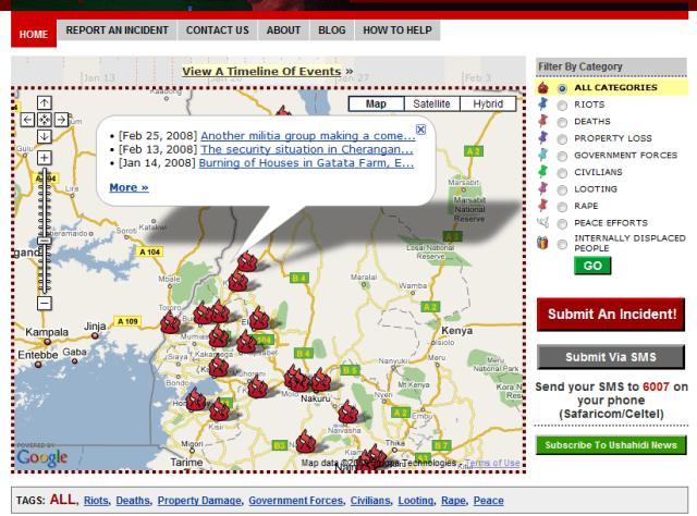
 

ushahidiscreen


Speaking in a February 2009 TEDTalk, Erik Hersman, one of the builders of Ushahidi, describes the application as “a system that would allow anyone with a mobile phone to send in information and reports on what was happening around them.” (See “How texting and GoogleMaps helped Kenyans survive crisis“)

Since mobile phones are increasingly available in Africa, Hersman says they make a good “common denominator” as a way for on-the-scene reporters to contribute to an overall view of what is happening during a crisis situation, such as a tumultuous political event, an armed conflict, or a natural disaster.

Hersman says that in the wake of the Kenya crisis, the Ushahidi group decided they needed to do more: “We needed to take what we had built and create a platform out of it so it could be used elsewhere in the world.”

Since then, the platform has been used by Al-Jazeera in Gaza, in the Democratic Republic of Congo, in South Africa to “map xenophobic attacks perpetrated against non-South Africans,” according to Ushahidi, and is now being used in India to monitor that country’s general elections.

However, the “next big thing,” Hersman believes, has to do with coping with information overload and evaluating the accuracy of reporting during crises:

What we’re finding out is that we have this capacity to report eyewitness accounts of what’s going on in real time — and we’re seeing this in events like in Mumbai recently — where it’s so much easier to report now than it is to consume [the reporting].

There’s so much information, what do you do? … How do you decide what is important? What’s the veracity level of what you’re looking at? … we find that there’s this great deal of wasted crisis information. Because there’s just too much information for us to actually do anything with right now.

During the initial hours when a crisis breaks out, says Hersman, a great deal of information can be streaming out of the crisis area — in the form of mobile messages, blogs, web postings, emails,or  Twitter messages. But the world outside the crisis zone, and indeed the citizens inside it, have no way to aggregate and process the extreme volume of reporting, as well as to evaluate the accuracy and truthfulness of it.

Hersman’s group is now working on a filtering process and technology that will “take the crowd and apply them to the information,” using peer ratings to evaluate, refine, and weight the reliability of data coming out of a crisis zone — “so that we have a better understanding of the probability of something being true or not.”

One key application of the Ushahidi crowdsourcing platform is to help relief organizations assess the situation in a crisis zone in real time and direct aid to the area as quickly as possible. “The idea is to get immediate attention and relief to strife zones, and fill the gap left by news organizations that have slashed their foreign bureaus,” writes Bahree in her Forbes article. She relates one experience of how this worked during the Kenya crisis:

A ranger in Bogoria (northeast of Nairobi), William Kimosop, was driving to check on a remote outpost one evening in January when he stumbled across several hundred women, old people and children, lost in a ravine as they fled their villages where the men were still fighting. Four babies were born in that ravine, and supplies were running out.

There were no government officials or police around. He sent a text message to a friend in Nairobi, asking her to get help from aid agencies. The friend forwarded his plea to a few people, after which it got picked up by Ushahidi and within six days a Red Cross truck reached him.

AB — 22 April 2009

Behind Tropicana’s failed re-brand

Natalie Zmuda, writing for Advertising Age, says that Tropicana’s full-reverse on its new branding for its Pure Premium orange juice line was surprisingly quick. “Beverage experts were hard pressed to think of another major brand that had pulled the plug on such a sweeping redesign as swiftly as Tropicana,” she writes. (See “Tropicana Line’s Sales Plunge 20% Post-Rebranding,” April 2, 2009.)

Her article gives some of the sales figures behind the reversal: “After its package redesign, sales of the Tropicana Pure Premium line plummeted 20% between Jan. 1 and Feb. 22, costing the brand tens of millions of dollars.”

At a press conference in January 2009 by Pepsico (owner of the Tropicana brand), Peter Arnell, CEO of Arnell Group, the branding agency that executed the redesign, explained his rationale (See Ad Age’s video of the press conference here):

We thought it would be very important to take this brand and bring it or evolve it into a more current or modern state … Historically, we always show the outside of the orange. What was fascinating was that we had never shown the product called the juice. There was a strong drive to bring a big messaging onto the carton where the biggest single billboarding was.

I think it was in the billboarding where Arnell failed. The instant I saw the two carton designs side-by-side, my first thought was, ‘The new one looks like a store brand.’:

Really, which one of these designs does a better job of billboarding? On the new carton, every color has been drained out (except the cute new squeeze-cap, which Pepsico will be retaining), and the new font looks almost generic.

It makes me wonder what kind of testing Arnell did with this new design. I would think one important part of the process would be to stock a supply of the new package design in an actual grocery-store cooler or shelf to see how well it stands out against the competition.

For a good example of on-the-shelf billboarding, take a look at this cereal aisle:

specialkht-001

See how Special K stands out on the shelf? The packaging does it.

In one of our ILO Institute reports (“Best Practices for CPG Design Teams”), we commented on the contribution packaging can make toward getting the attention of shoppers in the store (we used this same photo in the report):

As an example of simple visual differentiation through packaging, we note that Special K achieves high visibility on the retail shelf with standard package sizes using one simple graphic technique – making sure that on the front of every package is a big red “K” with a mostly white background. This emphasizes Kellogg’s offering by placing a distinct swath of giant “Ks” across the cereal aisle.

We also used the following example from spice company McMillan:

mcmillanshelf

In our report, we commented:


McMillan’s shelf dispensing system achieves strong visual emphasis for its spice products. In the case of the display shown here, McMillan’s has even gotten the retailer to agree to alter its shelving configuration to accommodate the dispensing system.

This emphasizes the importance of including on the product design team members who are knowledgeable about the retail destination of a new product and the restrictions likely to be encountered in the store.

One positive aspect of the Tropicana re-branding debacle is that we analysts now have another negative case study to refer to!

AB — 3 April 2009


Google Noticeboard: Net-based communications for “have-nots”?

In a recent article on his Content Nation site, John Blossom of Shore Communications discussed the possibilities for the new Google Noticeboard application as an Internet and computing tool for the world’s 5 billion people who are too poor to have Internet access.

Blossom is a respected expert in the content industry, and his new book, Content Nation: Surviving and Thriving as Social Media Changes Our Work, Our Lives and Our Future, explores the future of society in light of social media.

In the recent article, “The Other Five Billion: Google Focuses on Truly Universal Publishing for Content Nation,” I learned of Blossom’s interest in the Hole in the Wall project, in which, Blossom writes:

… in the back alleys of New Delhi poor children with no previous exposure to computers were given access to the Web via a PC embedded in the wall of a building. Almost immediately they became what an adult would consider “computer literate” and started teaching one another how to publish and how to collaborate on content.

The Hole in the Wall has also has also attracted my attention for its lessons on human-computer interaction. For more on the Hole in the Wall, see my blog entry “The Hole in the Wall: Computing for India’s Impoverished.”

The Google Noticeboard application Blossom discusses allows people to use publicly-shared computers to send text or voice messages through public Noticeboards. The application is designed such that it can be used by people with no computer experience, or even people who are illiterate.

The following series of images gives an idea of the interaction design:

AB — 1 April 2009

SixthSense prototype portends “The Internet of Things”

Today I learned about SixthSense, a wearable gestural computer interface developed at MIT’s Fluid Interfaces Group, a research group devoted to the design of interfaces that are “more immersive, more intelligent, and more interactive.”

Here’s how the group describes the interface:

The SixthSense prototype is comprised of a pocket projector, a mirror and a camera. The hardware components are coupled in a pendant like mobile wearable device. Both the projector and the camera are connected to the mobile computing device in the user’s pocket. The projector projects visual information enabling surfaces, walls and physical objects around us to be used as interfaces; while the camera recognizes and tracks user’s hand gestures and physical objects using computer-vision based techniques.

These images give you an idea how the prototype works and the kind of functionality it presages:


Here’s a link to a video that shows some great demos of SixthSense.

Fluid Interface Group’s work makes me think of one of the best film portrayals of a futuristic computer interface: the one Tom Cruise uses in the film Minority Report. In the movie, Cruise’s character uses virtual-reality gloves to manipulate a large interface virtual interface in front of him — very exciting to see.

This work of the Fluid Interface Group touches on the “Internet of Things,” an idea I first heard put forward by the Auto-ID Labs, a group working in the area of networked RFID. One of our ILO Institute reports on new directions for RFID discussed some of the possibilities for this Internet of Things:

If miniature Web pages and servers could be embedded in building materials, components of vehicles and aircraft, furniture, appliances, apparel, and other places, this could have huge implications for marketing, communication, and provision of services, not to mention changing the very nature of the world around us.

MIT’s Sanjay Sarma tells ILO researchers that this Internet of Things is “going to have a huge impact,” and that RFID is one of the key enabling technologies. He points out that RFID creates a greatly increased connection between the physical world and the world of information by connecting more data to physical things and transferring it at much greater speeds in much greater volumes. “We used to connect data to the physical world through keyboards, but there’s only so much data you can get in through the keyboard. But with RFID it’s automatic and it’s happening all the time.”

Sarma says that the Internet of Things will allow you to “have control in your enterprise in a way that is completely unprecedented.” Sarma calls this control “high-resolution management—management with eyes everywhere, as opposed to management by gut reactions and guesswork.”

The high volume and extreme complexity of this Internet of Things presents unique opportunities and challenges for the technology provider. “If you are in this market,” says Sarma, “you should be looking more and more at distributed computation, and you should be looking at embedded computations, at areas related to distributed software, at software related to data acquisition, and at software related to process change. They’ll all be changing in the next ten years.”

(“Directions for New RFID Initiatives,” ILO Institute, Aug. 23, 2006)

AB — 17 March 2009

Best argument for remixing: Watch this video

Just today I saw a video that is probably the best argument I have ever seen in favor of remixing. Please watch and listen to Mother of All Funk Chords. Fantastic!

Here the author explains how he makes his remixed music videos.

If you prefer an intellectual argument over an experiential one, see this video lecture by Stanford law professor Lawrence Lessig. Lessig has spoken at some of our meetings at the Institute for Innovation in Large Organizations (ILO). See Lessig’s blog here.

Lessig is probably the best thinker around remixing and interesting to listen to. But watching Mother of all Funk Chords is a lot more fun.

AB — 10 March 2009

Idea Mapping — basics and some resources

For several years, I have been using a process called idea mapping as a thinking tool. This is related to Mind Mapping, the brainchild of Tony Buzan. (See this page for some great examples of Mind Maps.)

I would describe idea mapping as a set of visual methods for thinking. I employ idea mapping in many kinds of settings — planning, outlining, note-taking, public speaking, writing, consulting, and leading group process. When working alone, I use unlined drawing paper and colored markers. When working with groups, I use a white board or large sheets of paper with colored markers.

Here are some books I recommend on this topic:

The Mind Map Book: How to Use Radiant Thinking to Maximize Your Brain’s Untapped Potential, by Tony and Barry Buzan

Mapping Inner Space: Learning and Teaching Visual Mapping, by Nancy Margulies and Nusa Maal

AB — 27 February 2009